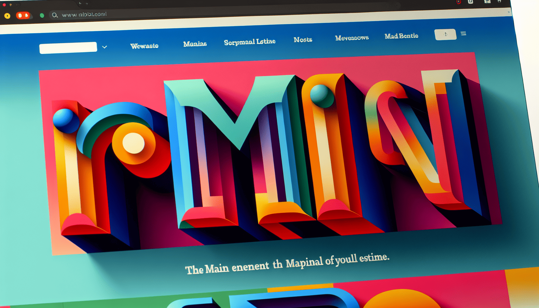
The ever-evolving landscape of web design continually introduces new elements that reshape user experiences and aesthetic expectations. Among the trends that have emerged and persisted over time is the use of bold typography. This striking design choice transcends mere text presentation to become a powerful tool for engagement and communication.
Bold typography in web design isn't just about making text larger or darker. It's a stylistic choice that commands attention amidst a sea of visual stimuli. In a digital age where users are bombarded with information, this approach ensures that key messages are seen and remembered. By strategically utilizing bold typography, designers can guide viewers through their websites, highlighting essential concepts and driving specific actions.
One of the primary reasons for the popularity of bold typography in web design is its ability to create a strong visual hierarchy. When visitors land on a website, they quickly scan through the content. Bold typography helps establish an order, directing attention first to the most critical elements such as headlines, calls to action, or value propositions. This hierarchical clarity improves user experience by making content digestible and intuitive.
Moreover, bold typography contributes to brand identity and personality. A carefully chosen bold font can embody the essence of a brand, whether it’s modern and sleek or traditional and trustworthy. Brands can leverage bold typography to create a visual language that resonates with their audience, reinforcing brand recognition with each interaction. The choice of typeface, size, and weight are integral to conveying the correct tone and message, demonstrating the nuanced power of effective typography.
The emotional impact of bold typography should not be underestimated either. It has the potential to evoke particular feelings and convey subconscious messages. For instance, thicker, bolder fonts can imply strength and confidence, while rounder, softer bold typefaces might suggest friendliness and approachability. Designers can manipulate these subtleties to connect with users on an emotional level, enhancing the overall narrative of the website.
Another significant advantage of bold typography is its versatility. It can be paired with minimalist designs to create striking contrasts or integrated into more complex layouts for emphasis. In responsive design, bold typography remains effective across various screen sizes, ensuring that the core message retains its impact on desktops, tablets, and mobile devices alike.
Successful application of bold typography relies on balance. Overuse or poor integration can lead to overwhelming and cluttered designs, defeating the purpose of enhancing clarity. It’s crucial for designers to consider factors such as the contrast between text and background, spacing, and the selective highlighting of specific text elements to prevent visual fatigue and maintain readability.
As web design continues to evolve, the trend of bold typography is here to stay, driven by its effectiveness in communication, its contribution to brand identity, and its aesthetic appeal. By embracing this trend, designers are not only keeping up with modern visual standards but also crafting user experiences that are memorable and meaningful. Bold typography is more than just a design choice; it's a dynamic tool that, when wielded with intention and creativity, can elevate web design to new heights.
